
Artioneer
Case Study for a mobile app that allows art galleries and art collectors to participate in art auctions (concept).
Problem
It is difficult to attend gallery auctions to purchase art if you have a busy schedule or you don’t live close enough.
Solution
Create an app that can be used from a smartphone in any location and on any schedule.
Tools
Figma
Jamboards
Duration
Jul-Nov 2022
Redesign Feb 2023
Roles
Researcher
UX Designer
UI Designer
Here’s the how:
Empathize > Define > Ideate > Prototype > Test
For this project, I interviewed six participants. It really helped me to empathize with the potential users and know who I am designing the app for.
It was extremely helpful to get feedback from users and acknowledge my biases.
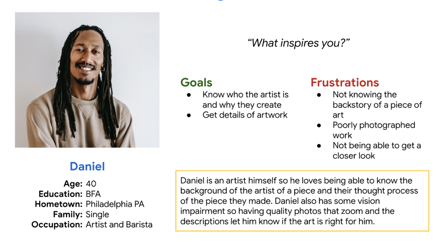
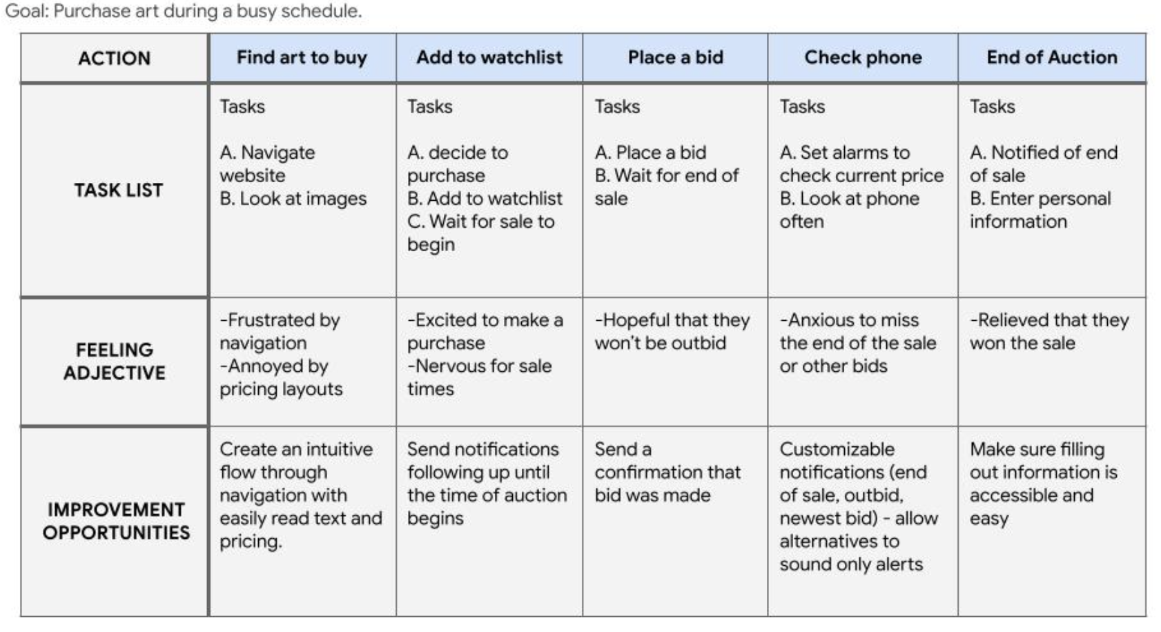
After the interviews, I created a couple personas, user journey maps, and a task flow to further understand the problems could be solved with designing this app.

Keeping the users’ feedback I sketched multiple iterations of each screen in paper wireframes.

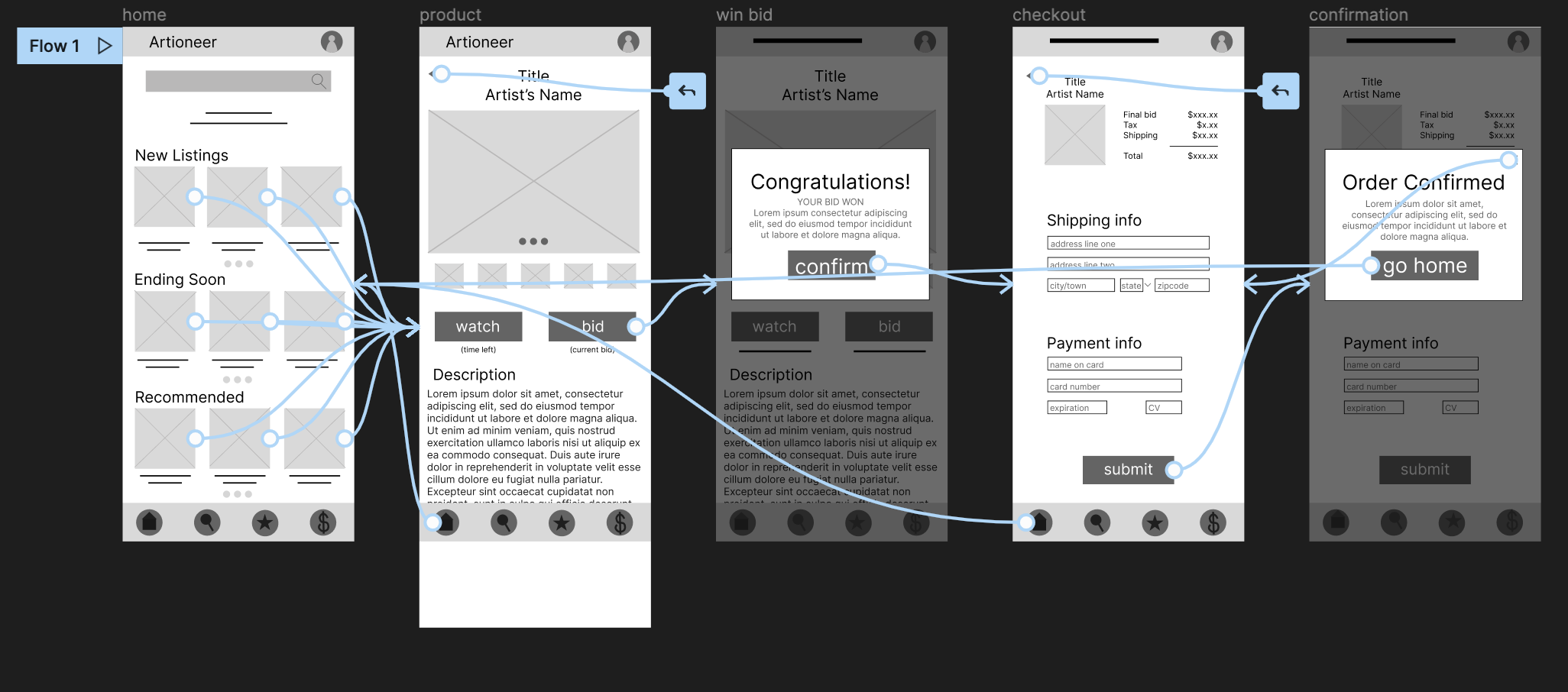
Once I had chosen the sketches I liked most, I went to Figma to make the lo-fi wireframes and a lo-fi prototype of one user flow.
I used Google Jamboards to organize the data from the user testing in an easily navigatible affinity map.

Usability Study #1 Findings:
Users needed a way to add their own bidding amount
The lack of confirmation worried all of the users
It was mentioned by a few users that the layout was a bit monotonous
I understood the participants’ frustrations with the lack of confirmation. I too would be scared if an app immediately told me I was buying something when I clicked a button!

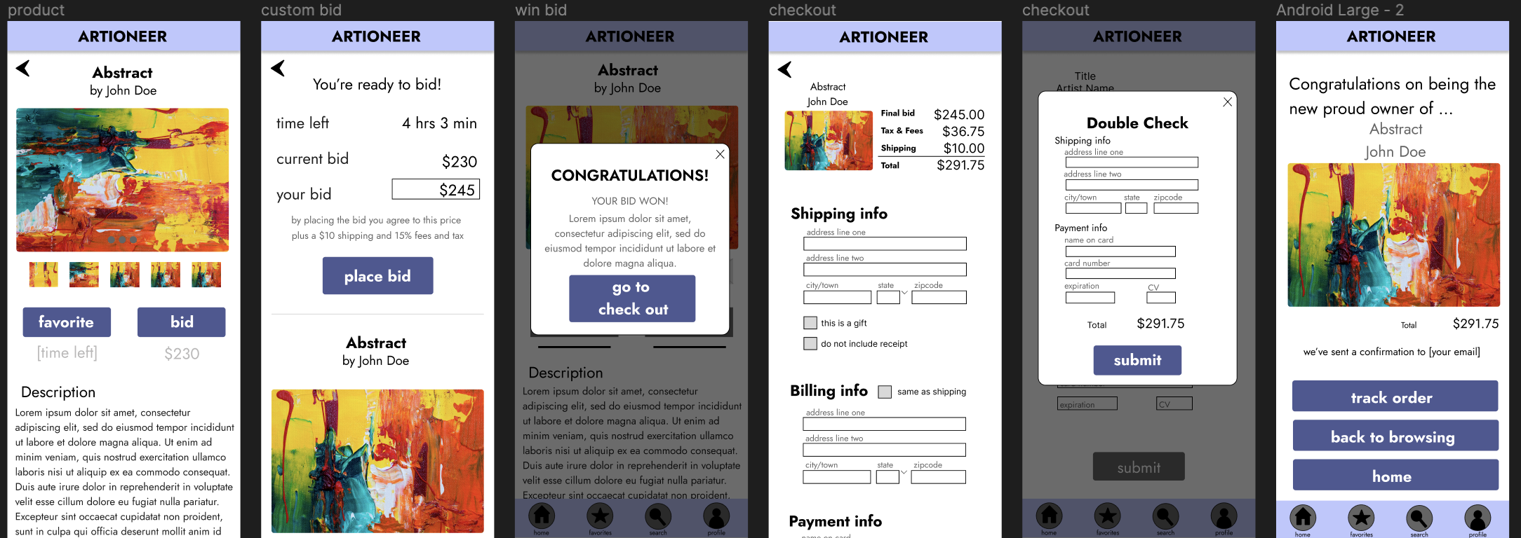
In the first mockup, I made sure to include more confirmation and also a page to customize the price to bid.
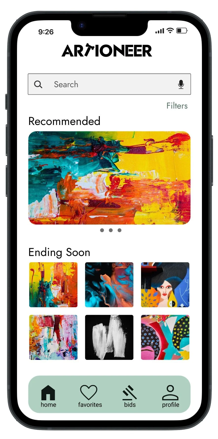
After further user testing, I redesigned the brand with a color scheme that would allow the art to be more of a focus in the app.
2023 Redesign


Before
After
What’s better?
-
• All frames have been checked with WCAG & A11y to meet at least the AA contrast guidelines.
• Icons are accompanied by text to help with screen readers.
• Animations follow W3C guidlines.
• A Voice-to-text microphone was added to the search bar.
-
I took into account the Gestalt Principles to make the layout intuitive and allow the user to understand groupings.
Things like negative space were better utilized to create some visual rest and make pages look a little less cluttered.
Each spacing follows an 8-point grid system to allow better hierarchy and consistent scalability.
-
By adding different line weights to the typefaces, I was able to further represent hierarchy and give more value to the text that would be most important.
I stuck with one font to create a sense of consistency and simplicity.

Takeaways:
I am so pleased with this project and I can say I learned A LOT!
This was one of the projects I completed through the Google UX Deign courses.
I learned the entire design process: user interviews, wireframing, prototyping, mockups, usability tests, and more. Plus I was able to feel very confident in using Figma!
With my redesign, I learned the importance of spacing and layouts. I believe I now have the skills to visually design a user-friendly and appealing app.
What’s Next?
There is always room for growth. If I were to redesign the Artioneer App yet again, I might reconsider my color choices. I wanted this app to be very accessible. There are parts that could be tweaked to fit the AAA guildlines for color contrast.
It would also be interesting to create a scalable website to go along with the app.
For now though, the plan is to take everything I have learned and impliment it into new projects where I can continue to learn even more!
Thanks for checking out my case studies!
Please feel free to reach out with any feedback or questions you have.