
Phunding Philly
Case Study for a dedicated mobile app and a responsive website designed for a concept nonprofit to help Philly schools with funding.
Problem
An organization in Philly needs an easier way for the community to get involved with donations or events without attending all of the meetings.
Solution
Create a dedicated mobile app and a responsive website that can be used from personal devices to get information and donate.
Tools
Figma
Mockup App
FigJam
Miro
Photoshop
Canva
Duration
Jan - Feb 2023
Roles
UX Design
User Interface
UX Research
Graphic Design
Design Process: Dedicated Mobile App
I reached out to teachers I know to find out what would be a good focus for a nonprofit and people who would be interested in donating/volunteering for nonprofits to see their opinions and experiences on how they get involved.


After conducting interviews for each of these possible users, I was able to make personas and user journey maps. This was also the point I was able to decide on which user flow I wanted to focus on for the beginning of the design.
The first thing I focused on was creating the dedicated mobile app.
I wanted to do a quick How-Might-We by using the Crazy Eight method.
I set a timer and quickly sketched each idea within a minute time frame.


I used FigJam to organize my thoughts and create a flow map.
From here, I was able to open the Mockup App on my iPad and sketch out some idea wireframes for what I needed to complete the user flow.
I had a good idea of what I wanted for the mobile app, so I made some mid-fi Wireframes in Figma.
I conducted some user testing of this process and took notes by using the chat feature directly on Figma.


I decided to create a logo for the nonprofit and design kit so I could keep have consistent branding through the app and website.
I used Canva to create a logo that would include a fun font to include the idea that the funding was for school-aged kids.
The flag of Philadelphia is blue and yellow. Blue is associated with reliability and yellow is associated with cheerfulness. I wanted users to feel a sense of warmth and happiness that could be associated with helping students.

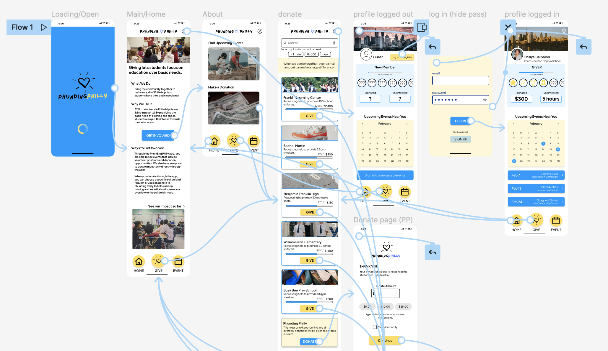
I used the design kit to create a final mockup and prototype of the user flow I was trying to show for the dedicated mobile app.
I also made sure to implement the changes that were synthesized from the usability testing.
Design Process: Responsive Website
I already had a rough idea of how the website would look since I had designed the mobile app.
I used Miro to create a site map to understand if the flow would be different at all.
The lo-fi wireframes were very similar to the mobile app, but with a few changes to be more fitting for a website.


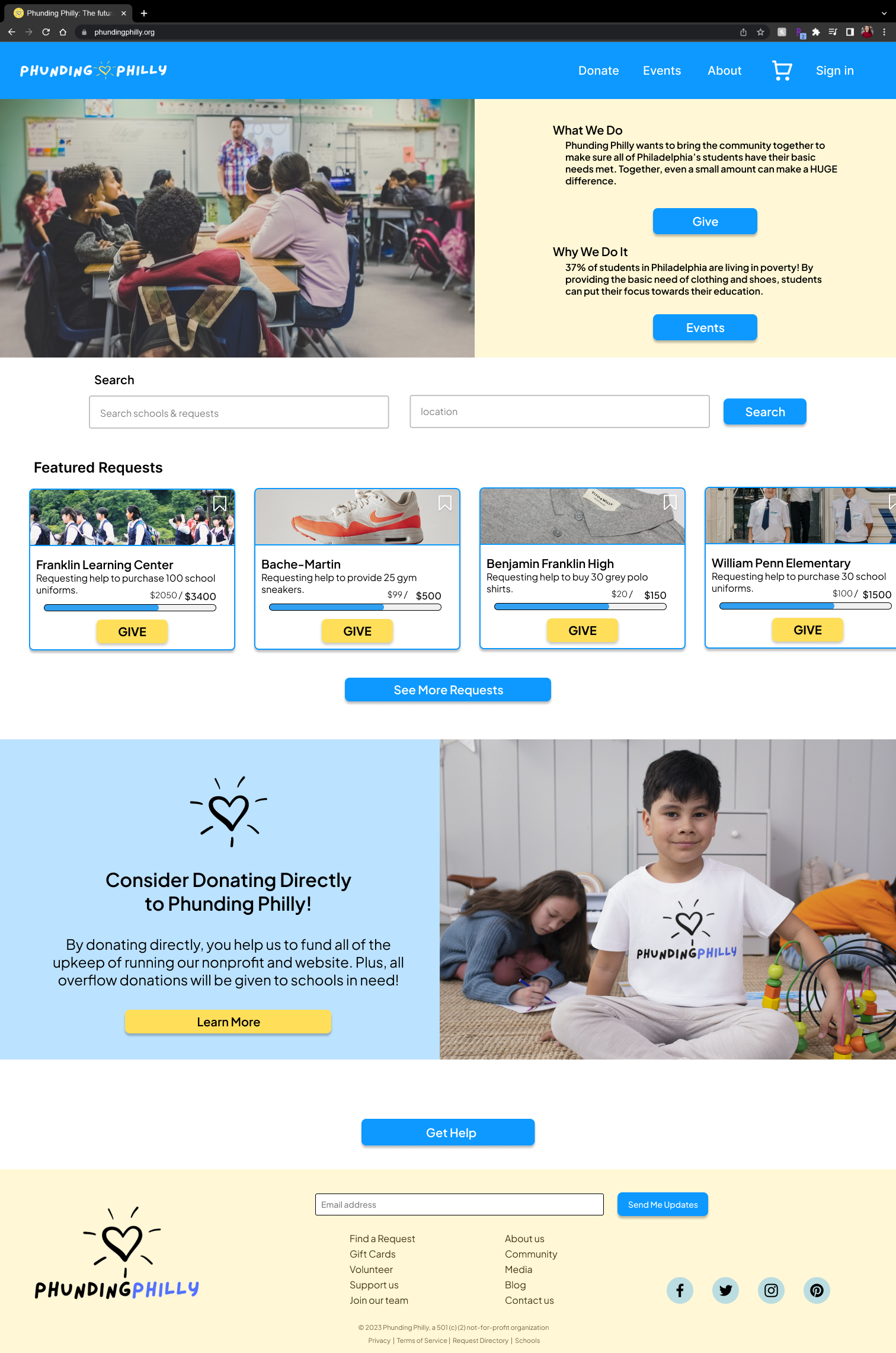

Mobile first philosophy puts the user first since mobile devices are rapidly becoming the most commonly used.
By using a progressive enhancement approach to the design, I started with the smallest screen size and moved to the largest screen size.
I made sure to reorganize and resize elements on every page of the flow. This allowed me to make sure that the size and shape of the screen that I was designing for was utilized in a user-friendly way.
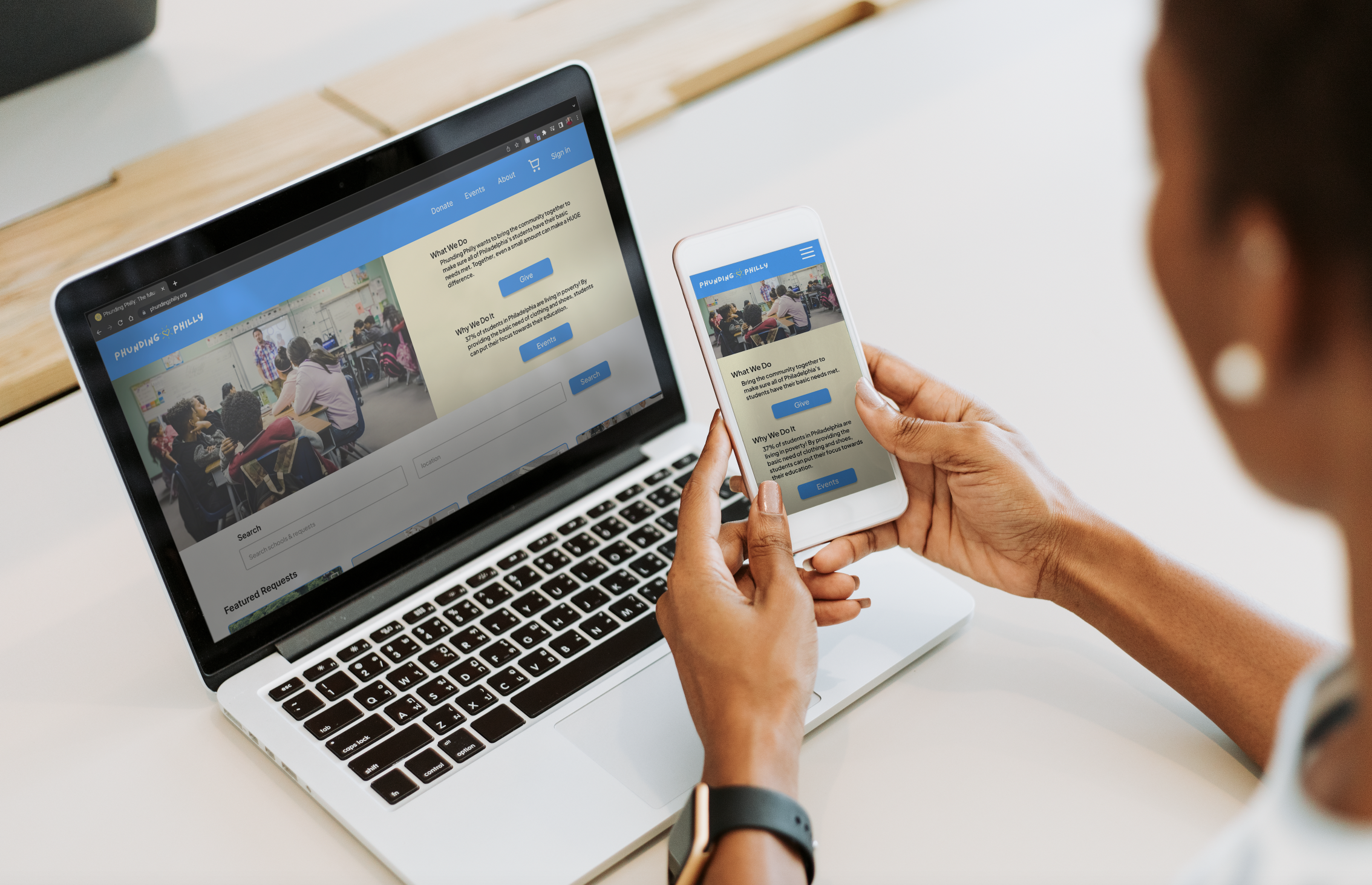
Outcomes:
I had a lot of fun with this project. It was fun to conceptualize a nonprofit to work with. From this project, I was able to obtain a long-term volunteer position with an actual nonprofit in Philadelphia called Art Shere Inc as their UX Designer.
I learned the mobile-first philosophy and progressive enhancement designs to make responsive web designs from smaller screens to larger screens.
What would I do next?
I did actually conduct another usability study and found there were some elements that users feel would make the flows more intuitive and leave them with less confusion or frustration. If I were to go back into this project, I would include these changes and try to clean up the user interface.
Thanks for checking out my case studies!
Please feel free to reach out with any feedback or questions you have.