TOGGERS

Case Study for a responsive Website exclusively for photographers to network with each other.
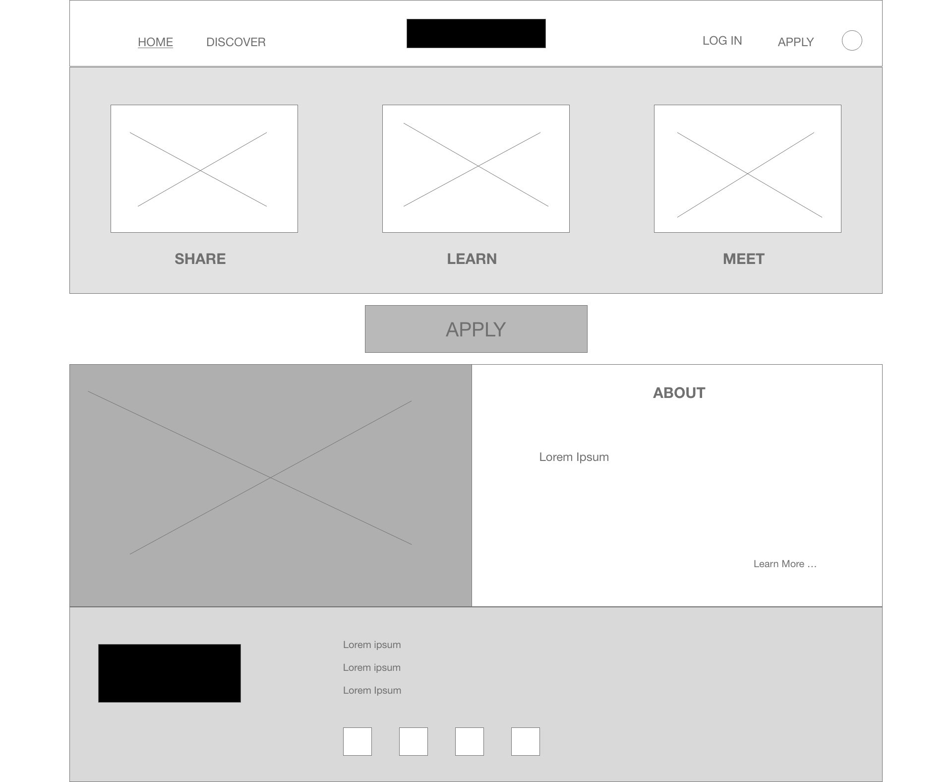
Wireframe of a website layout with navigation menu, image sections labeled 'Share,' 'Learn,' and 'Meet,' and buttons labeled 'Apply' and 'Learn More'.
Sketch of a webpage with a logo at the top, three product images with X marks, a large oval button, and a bottom section with placeholder text and icons, labeled 'About' and 'Logo'.
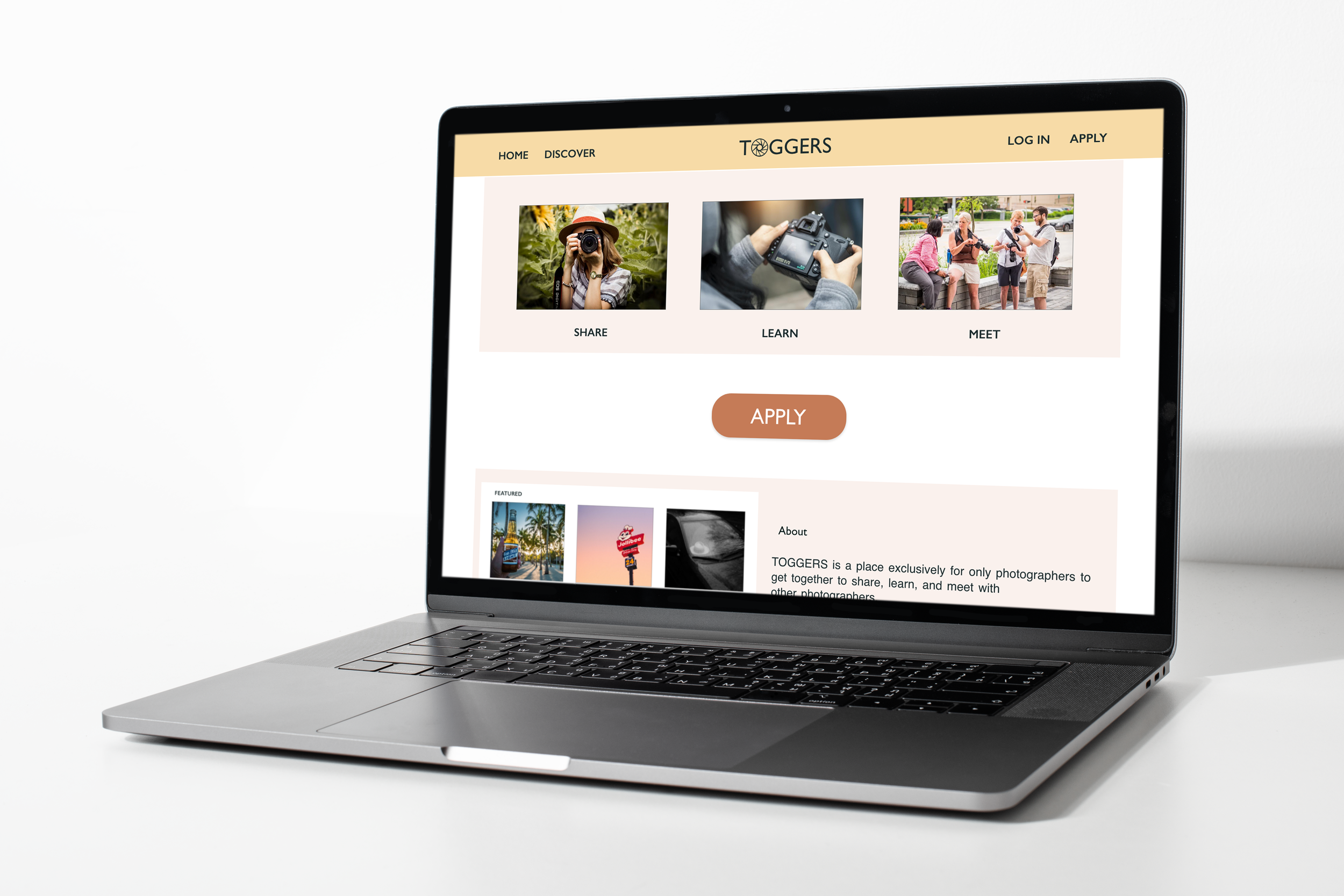
A webpage for Toggers featuring three images and categories such as Share, Learn, and Meet. The images include a woman taking a photo with a camera, a person holding a camera, and a group of people talking and taking photos outdoors.
A woman wearing a hat and scarf, holding a camera, standing outdoors among green plants.
Laptop displaying a website called Toggars, featuring images of people taking photos, a camera, and group discussions.

Problem

The current social networking sites are oversaturated with random photos shared by non-photographers.

Solution

Create a website that can be exclusive to photographers that allows an easy application process.

Tools

Adobe XD

Duration

Nov-Dec 2022

Roles

Research
Design

The process…

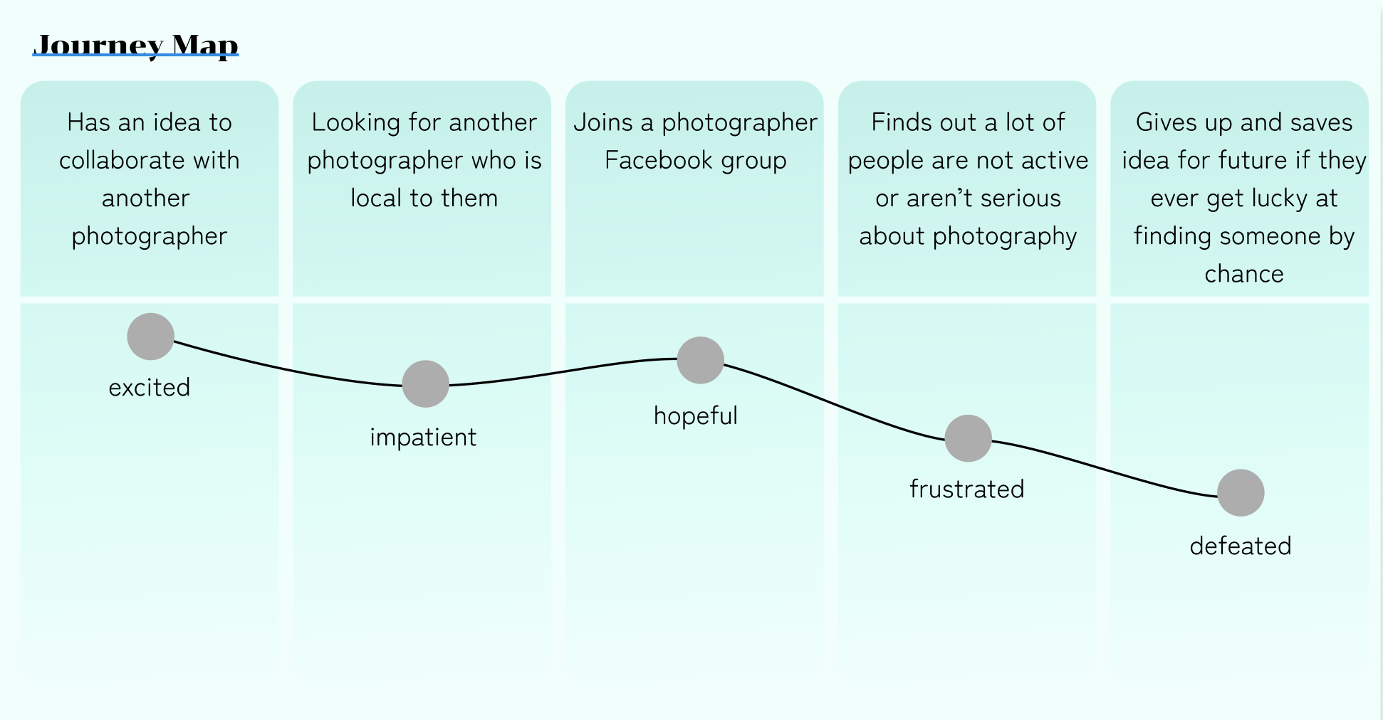
After conducting preliminary user interviews, I created personas and user journey maps to better empathize and figure out what the users’ needs and goals would be of this new product would be.
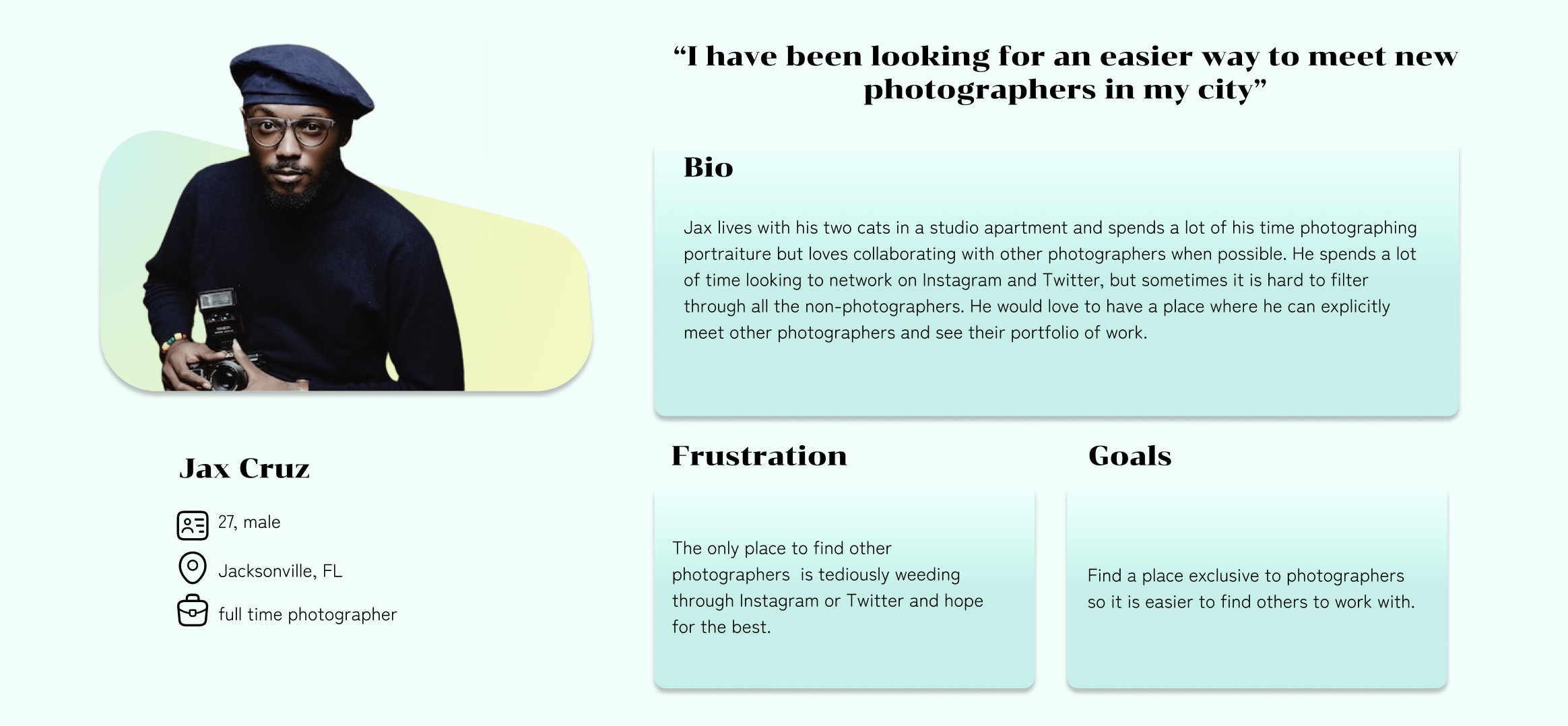
Profile of a man named Jax Cruz wearing a navy beret, glasses, and a black sweater, holding a camera, with his bio and photography goals displayed in a colorful profile layout.
A journey map showing different emotional states from excited to defeated connected by a line, with steps labeled as having an idea to collaborate, looking for a local photographer, joining a Facebook group, discovering unactive or non-serious photography people, and giving up to save the idea for future.

I organized the data from the interviews to find common painpoints.

Oversaturation

All of the participants mentioned that instagram is a place to share photos but it is oversaturated with everyone’s photos including non-photographers.

Lack of details

A lot of artists want to know the mediums and the way an image was created. Photographers are no different and would love to know the settings and camera used to create a photo.

Finding Locals

It is really hard to find other local photographers to work and collab with. The only options seem to be in-person networking.

Next Step: Wireframing

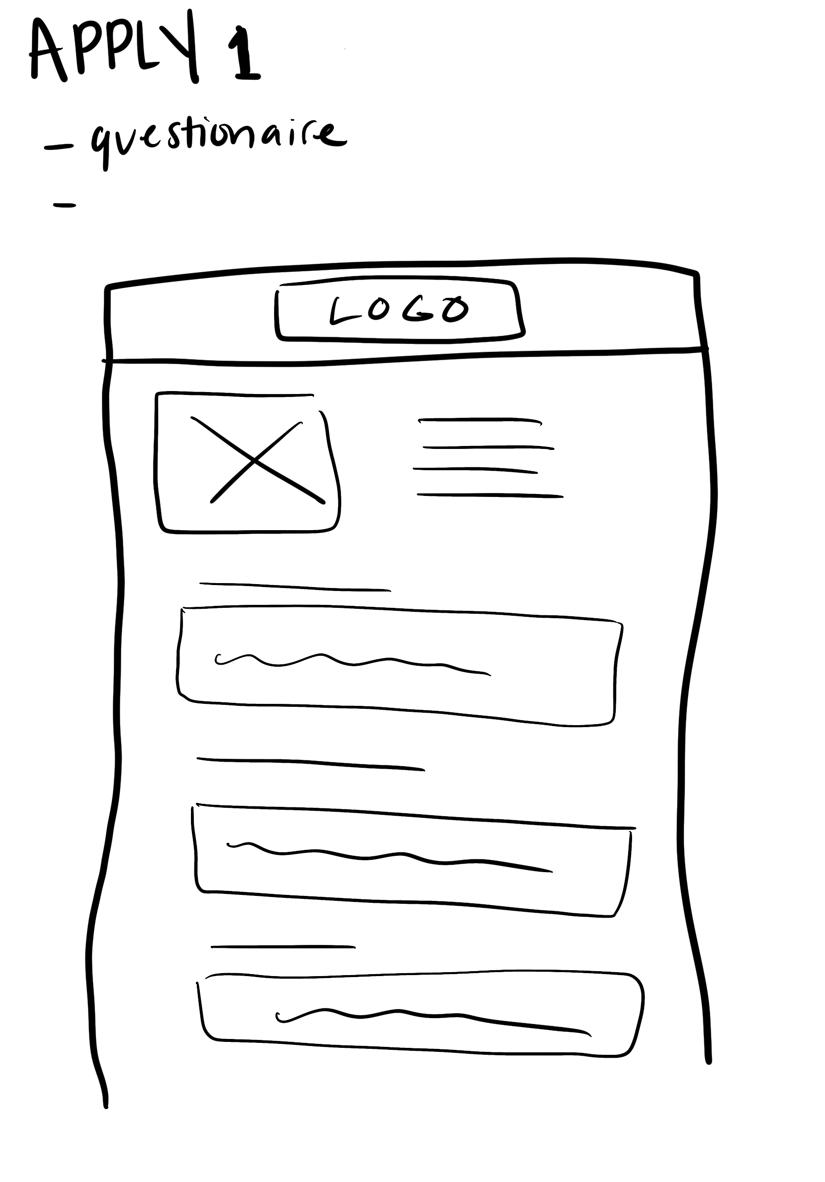
Before heading into lo-fi digital wireframes, I made sketched out paper wireframes using procreate on my iPad.
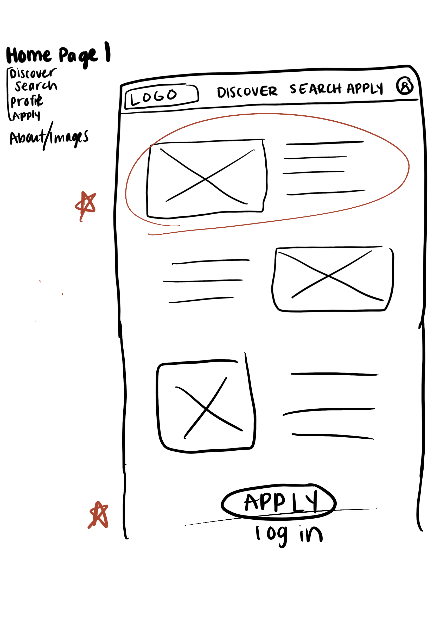
Sketch of a mobile app interface with navigation menu on the left, header options at the top, and several content sections featuring placeholders for images and text, including a large 'Apply Log in' button.
Hand-drawn sketch of a webpage layout with a header labeled 'LOGO,' a large box with an 'X' indicating an image, and multiple horizontal lines representing text.
Hand-drawn sketch of a mobile app interface with a header labeled 'LOGO,' large text reading 'APPLY,' several horizontal lines representing text or input fields, a button, and a footer with a 'LOGO' label, three circles, and three dots.
Sketch of a web page layout with a logo at the top, three boxes with X marks, an oval button, and a sidebar with 'About' and lines of text.

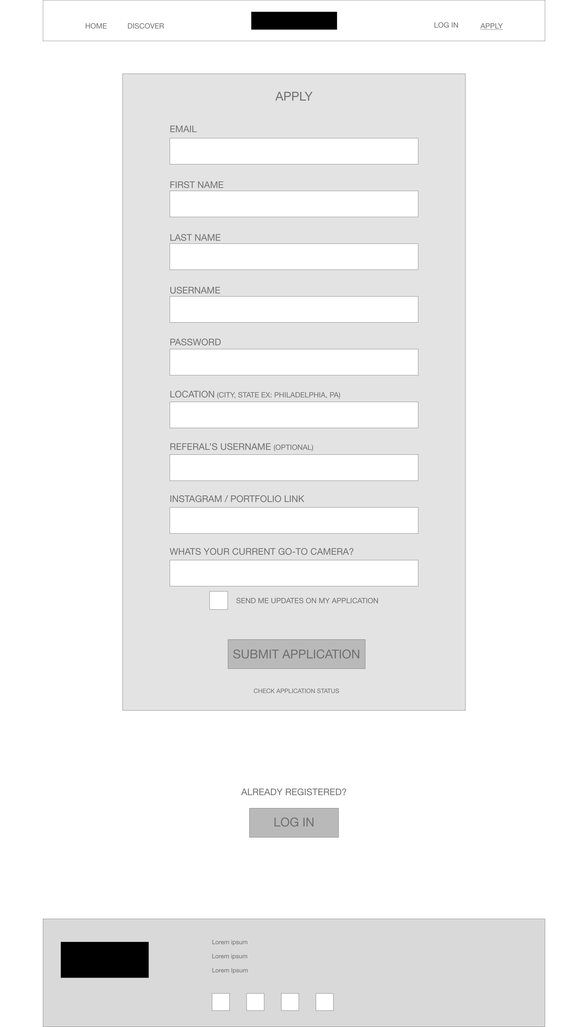
After I understood the layouts I wanted, I jumped into Adobe XD and started to create digital wireframe layouts.
Wireframe of a website layout with navigation menu, header, content sections labeled 'Share', 'Learn', 'Meet', 'Apply', and 'About', and placeholder images.
Website registration form with fields for email, name, username, password, location, referral's username, Instagram link, current camera, newsletter option, submit button, and login link. The page has a header with navigation options and a footer with placeholder text and icons.

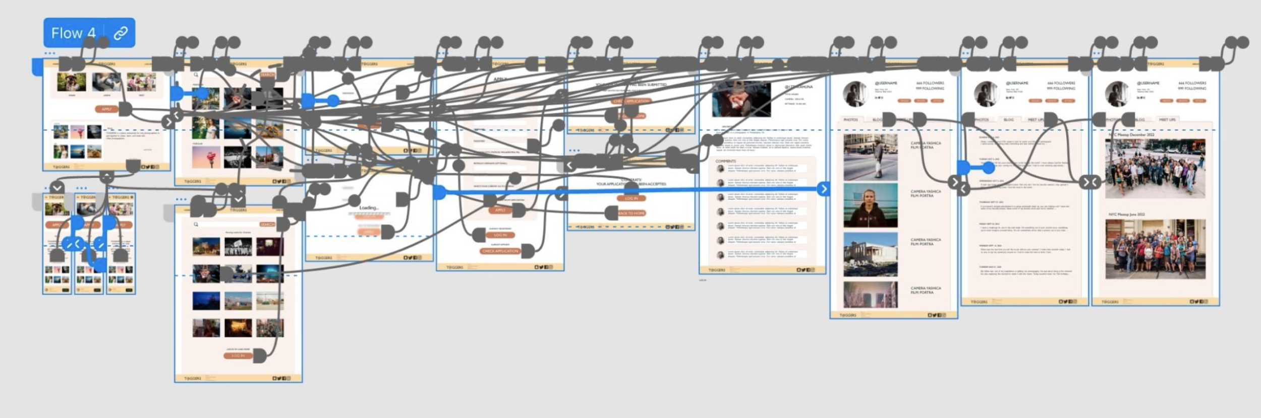
Once the digital wireframes were completed, I added interactions to make a lo-fi prototype that could be utilized to conduct the first usability study.
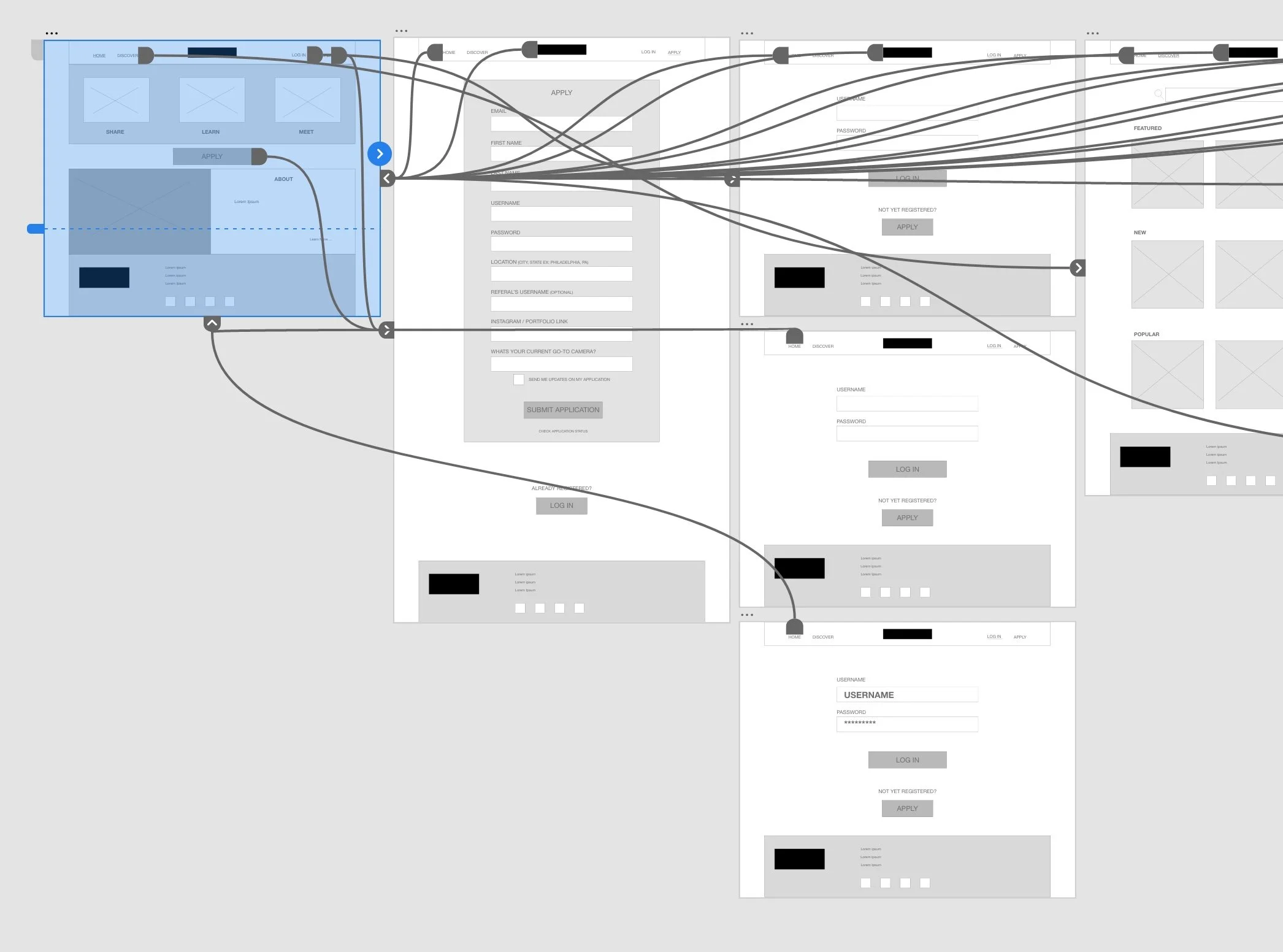
Screenshot of a user interface flow diagram showing multiple wireframes of a website or app, connected with lines indicating navigation paths. The wireframes include screens for home, login, registration, and various content sections, some with placeholder text and buttons.

The participants from user testing gave a lot of great feedback which was able to be implemented into the design when I created the mockups.
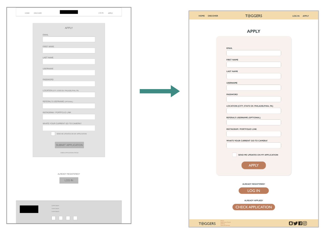
Comparison of two website registration forms, one in grayscale and the other in color, titled 'APPLY' with fields for email, first name, last name, username, password, location, referral's username, Instagram/portfolio link, current camera, and a checkbox to receive updates, featuring buttons for submission, login, and application check.

Rinse & Repeat!

Flowchart with multiple interconnected screens, images, and text illustrating a process or project, with blue and orange accents.

The process of prototyping and testing was repeated again with the hi-fi mockups.

Person holding a smartphone displaying the Toggers app, with a laptop in the background showing the same app interface on its screen.

What did I learn?

This is my first website project and first project in Adobe XD. I quickly learned the basics of Adobe XD and what I did and didn’t like about the program. I also learned that creating a responsive website can be tricky, but worth it!

Where to go from here?

Knowing everything I know now, the UI design of this project is not very successful and could use a lot of help. If I were to revisit the project, the visual design would be the first thing I would upgrade.

Thanks for checking out my case studies!

Please feel free to reach out with any feedback or questions you have.